Health care data, especially in administrative databases, are often longitudinal. This means that each patient has multiple encounters, each corresponding to a different time point. For example, a patient may have a encounter for each visit, each procedure, and multiple telephone and portal encounters. We often want to collect data from these encounters and summarize them in a way that is useful for analysis. We often want to track each patient over time, to see the natural history, or a response to a change in therapy.
6.2 The Spaghetti Plot
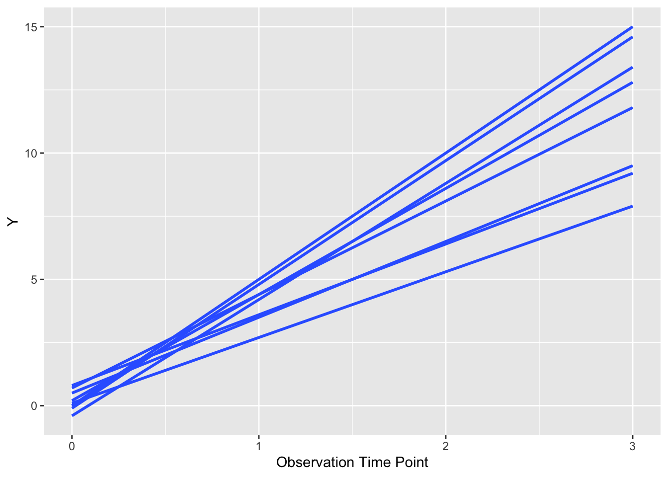
The Spaghetti Plot is a visualization that shows change over multiple time points for longitudinal data, which lets you see change in each individual as a line. It gets the name because the result (with method = “lm”) looks a bit like you scattered uncooked spaghetti (straight lines) on the plot. It’s a great way to show changes in data over multiple time points, and there are multiple variants, including summary smoothed lines.
Note that a bit of data wrangling needs to be done to produce the correct data format for geom_line(). You may need to pivot_longer() to get 1 row of data for each data point, and an id for each individual (multiple points making up a line. This id will often be a patient id (pat_id). We will read in some simulated data below for 4 time points. The variables are time point, the value, ses (2 categories), elderly (2 categories), and pat_id for 8 patients.
The code below will illustrate the basic spaghetti plot.
As you can see, this plot looks a bit like spilled (uncooked) spaghetti, with a line for each patient. Each patient is the same (default) color. Note that it is critical to group by the patient id (group = factor(pat_id)) so that ggplot knows which points go together as a line. If you remove this bit of code for the group argument, you get chaos from geom_smooth() or geom_line(). We can also let each patient’s line follow their actual values, rather than a fitted line, with a few modifications. Run the example below.
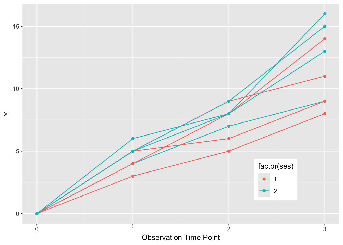
Now each patient is represented by a line (and points) with more detail than a fitted straight line.
We can also chose to color these lines in two classes by ses (SocioEconomic Status) by setting color = factor(ses). We can make the legend neater by putting it inside the plot boundaries with theme (legend.position), and use the x and y range from 0 to 1 to position it. Google how to do these two things, and try to implement them in the code chunk above.
You can see the solution below if you get stuck.
ggplot(dat, aes(x = time, y = value,group =factor(pat_id), color =factor(ses))) +geom_point() +geom_line() +theme(legend.position =c(0.8, 0.2)) +xlab("Observation Time Point") +ylab("Y")
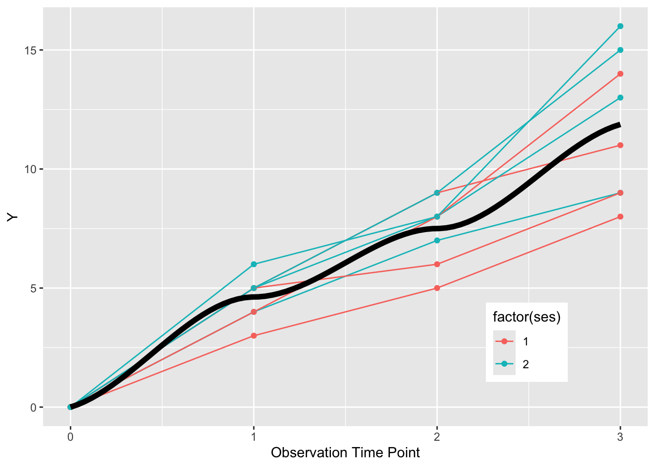
If we want to summarize the overall trend, we can use a geom_smooth() with the default loess smoothing. We set the color to “black”, rather than the color of either SES group. In order to get a single summary curve, we need to turn off the grouping with group = NULL. Note the loess smoothing produces a curve in the code below.
ggplot(dat, aes(x = time, y = value,group =factor(pat_id), color =factor(ses))) +geom_point() +geom_line() +theme(legend.position =c(0.8, 0.2)) +xlab("Observation Time Point") +ylab("Y") +geom_smooth(formula = y ~ x, se =FALSE, linewidth =2, method ="loess", color ="black", aes(group =NULL))
Now a challenge for you - how would you make 2 distinct summary curves for the low and high SES groups, each in the appropriate color, but in linewidth = 4?
Try to modify the code chunk below to achieve this.
Now a challenge - facet this plot into one facet for the young, and one facet for the elderly.
6.3 More Challenges for You
Improve the first draft of the plot from the code chunk above. Google to find out how to do each of these in ggplot, then implement these in the code chunk above.
See the initial plot above for CRP with smooth lines for each patient, then try it for FCP.
Now plot the CRP values, and change the grouping to patid without colors, and use geom_point() and geom_line() rather than geom_smooth to see the CRP trends in black.
Now plot the CRP values, and add to the aes, color = factor(dz_type) OR color= factor(flare) to group = factor(patid)
Now plot the FCP values, and add the geom_smooth with group = NULL and color = factor(flare). Also facet_grid by dz_type, and see if you can improve the default legend title and labels (might need to google these).